Alert Reykjavik
The challenge
Local public services are usually taken for granted until they fail. When the garbage truck is late or a road crew closes your commute route without warning, you often find out the hard way. For residents of the Reykjavik metro area, that moment of discovery often comes too late and from the wrong place – a neighbor’s Facebook post or a news headline.
The brief for this project was to design a new feature that fills this gap – an alert service built into the City of Reykjavik’s existing digital platforms that proactively notifies residents before, during, and after disruptions affecting their life.
Research
With the initial problem statement, i.e. alerting citizens about hazards and service disruptions, I set out to find references from other cities. The best examples I found were from North America, and I benchmarked three established citizen alert systems: Notify NYC, Voyent Alert, and Alert Seattle.
- Notify NYC is the mature gold standard. It has been running since 2007 across emergency, disruption, and community alerts on the widest channel set, but its web sign-up has notable UX flaws and over-frequent notifications.
- Voyent Alert, a commercial product used mainly across Canada, stands out for frictionless OTP sign-up (no account) and granular, well-targeted alerts, though held back by a dated UI and reliability issues.
- Alert Seattle takes a lean, emergency-first approach via Smart911 with multi-language support, but its notification scope feels confusing and unfocused to users.
Together these three products showed me that trustworthy alerts depend less on breadth of features and more on low-friction sign-up and tightly scoped, relevant messaging.
The survey
To validate my hypothesis and find participants, I launched a screener survey – in Icelandic, distributed through neighborhood Facebook groups, that ultimately gathered 155 responses from across the Reykjavik metropolitan area.
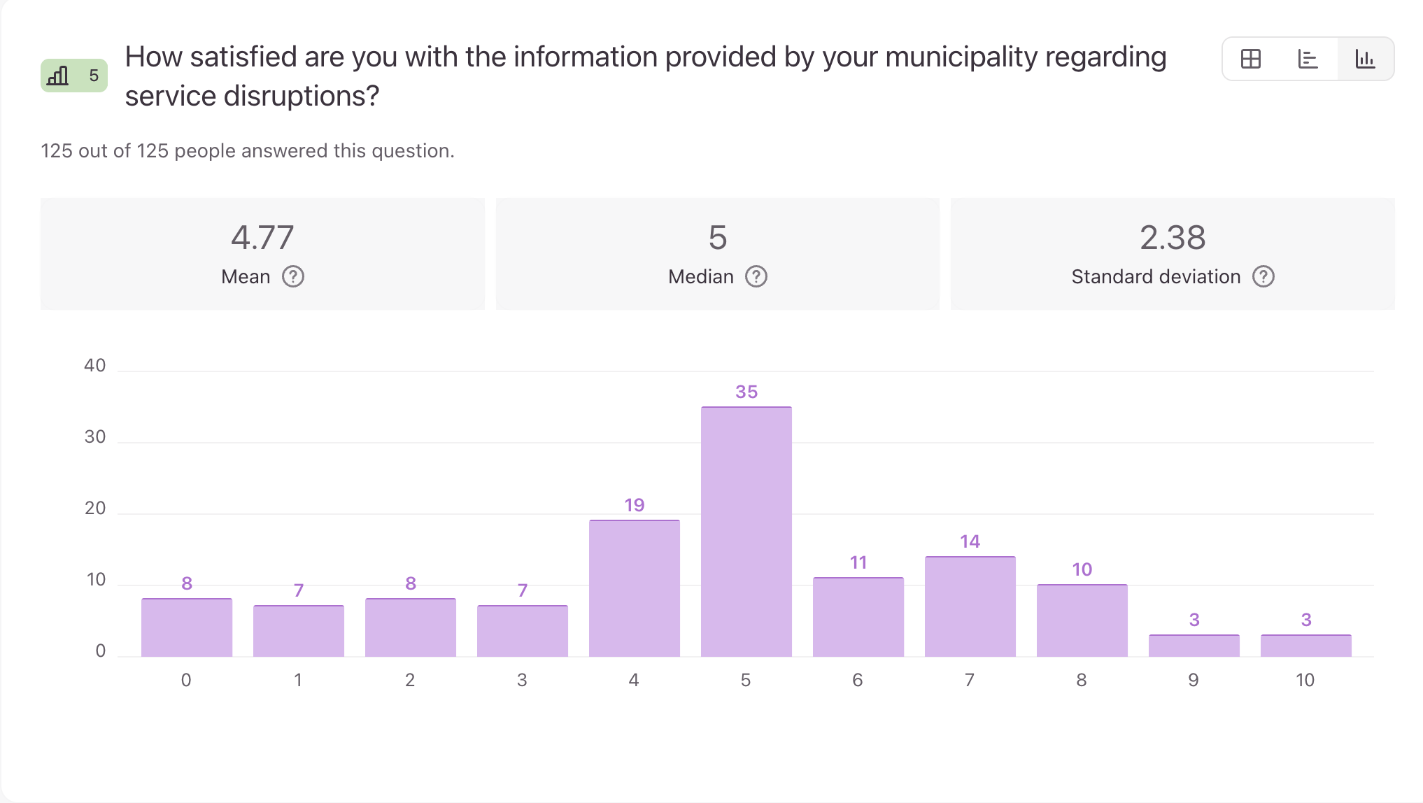
When asked how satisfied they were with municipal communication about service disruptions, respondents gave a mean score of 4.77 out of 10. This was not a marginal dissatisfaction but a widely shared, clearly felt gap.
When asked how they currently learned about disruptions, 67.2% cited news and media and 62.9% cited social media – primarily neighborhood Facebook groups. The official City website came in at just 12.9%.
Asked to imagine a world where proactive real-time notifications existed and they could choose their preferred delivery method, 76.6% chose a direct notification.
The interviews
I conducted 6 in-depth interviews in early March with residents of Reykjavik and surrounding towns. The interviews confirmed the survey findings but added some insights.
One theme recurred in almost every conversation: the frustration wasn’t the disruption itself but the silence around it. The interviews also revealed a pattern of workaround behavior. Residents had developed their own informal infrastructure for civic information, for instance Facebook groups where neighbors paste screenshots from City press releases.
The Veitur utility company emerged as the gold standard for how notifications should work. They always send an SMS when there’s a local water or electricity outage, and an email to affected residents when there are planned maintenance works. Every interviewee mentioned them.
I mapped interview findings into an affinity diagram, which surfaced four dominant themes:
- The need for local relevance (not city-wide noise)
- The value of advance notice (not just in-the-moment alerts)
- SMS as a protected trust channel, and
- The importance of closing the loop (what happened)
Persona
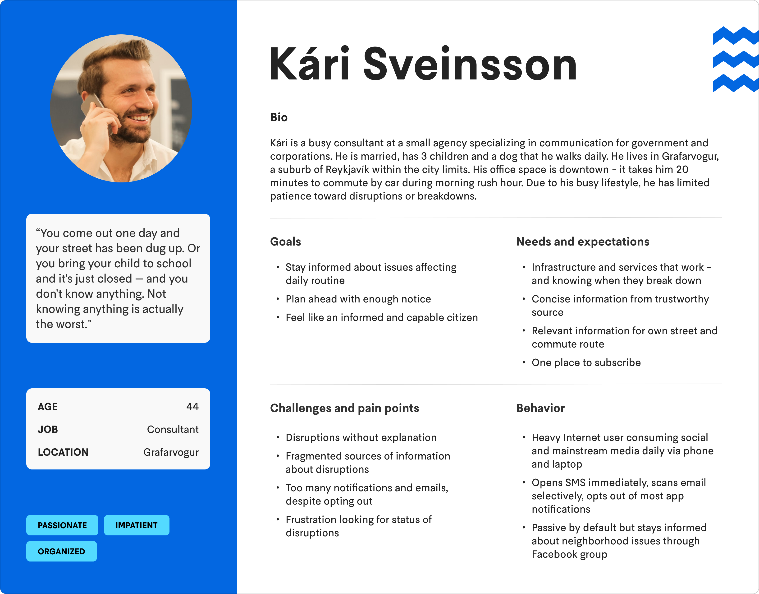
Kári Sveinsson is the primary persona based on the research findings. He doesn’t want more notifications. He wants better notifications, rare enough to always read and specific enough to always matter.
Defining success
From the user’s perspective, success means receiving relevant, timely, trustworthy information about disruptions without having to look for it.
From the City’s perspective, success means fewer inbound calls and complaints about unexplained disruptions, a reduction in dependence upon unofficial channels like Facebook, and a new accountability loop in resolving disruptions.
Two channels – one rule
Early in the design process, I faced a fork in the road: let users choose their notification channel (SMS, email, or both) for each category of alert, or make the channel decision on their behalf based on the type of alert.
User choice comes with a cost. Every additional toggle in a sign-up flow is friction. And more importantly: the value of SMS depends entirely on its rarity.
I decided to split channels by alert type, not by user preference:
- City-wide alerts — severe weather, city-wide pollution, major incidents, civil protection emergencies — delivered by SMS only. These are rare, affect everyone, and require immediate attention.
- Local notifications — construction close to your street, delayed garbage collection, a nearby school closure — delivered by email only.
Designing the feature
I created 3 user flows – view alert dashboard, subscribe to notifications and receive notifications. The most complex one, subscribe to notifications, is shown below.
The biggest issues were:
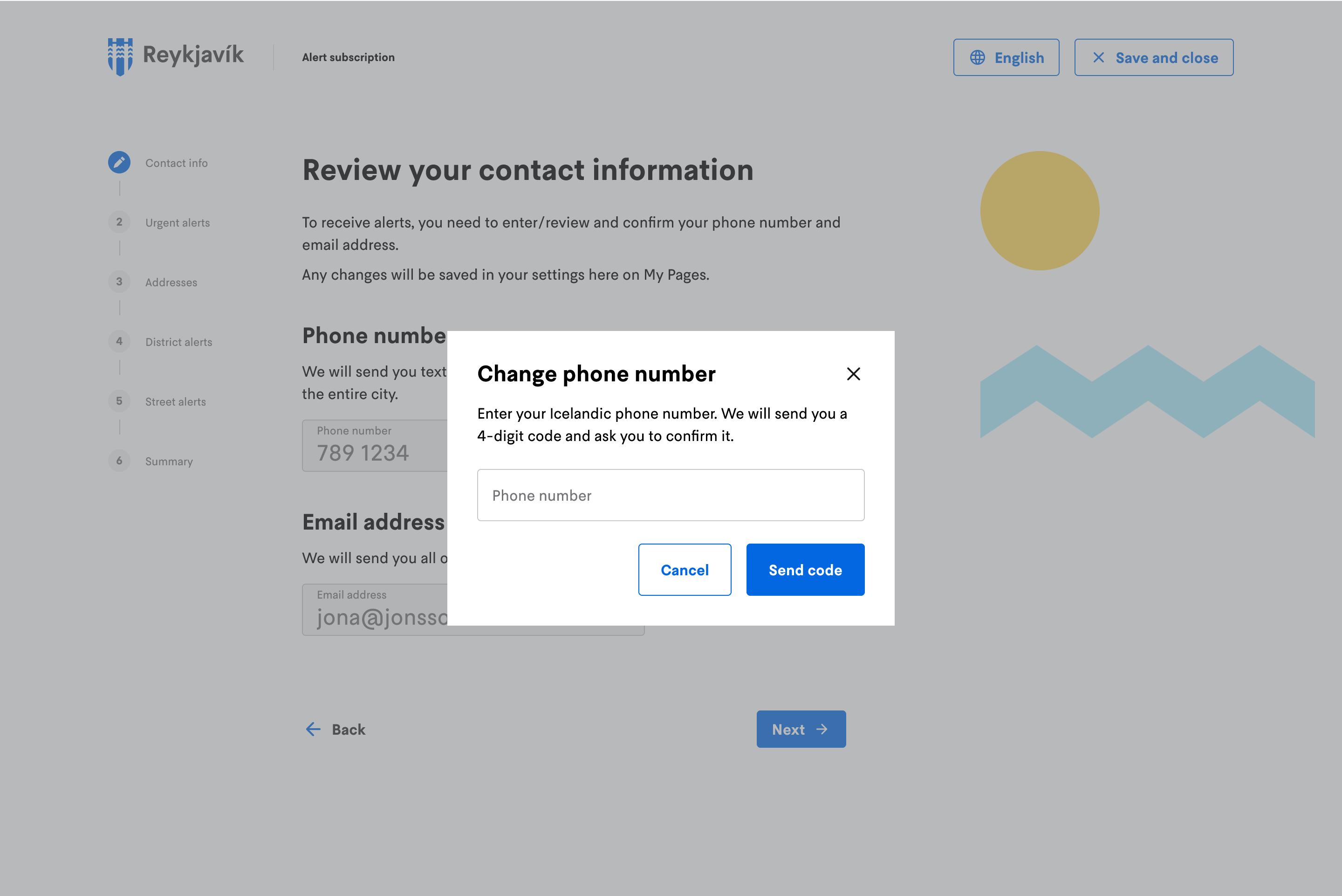
- Should the subscription flow also handle corrections to emails and phone numbers? I decided to go for that, since this information is vital and the user would otherwise have to leave the flow. In addition, I added a validation feature which is not part of My Pages today.
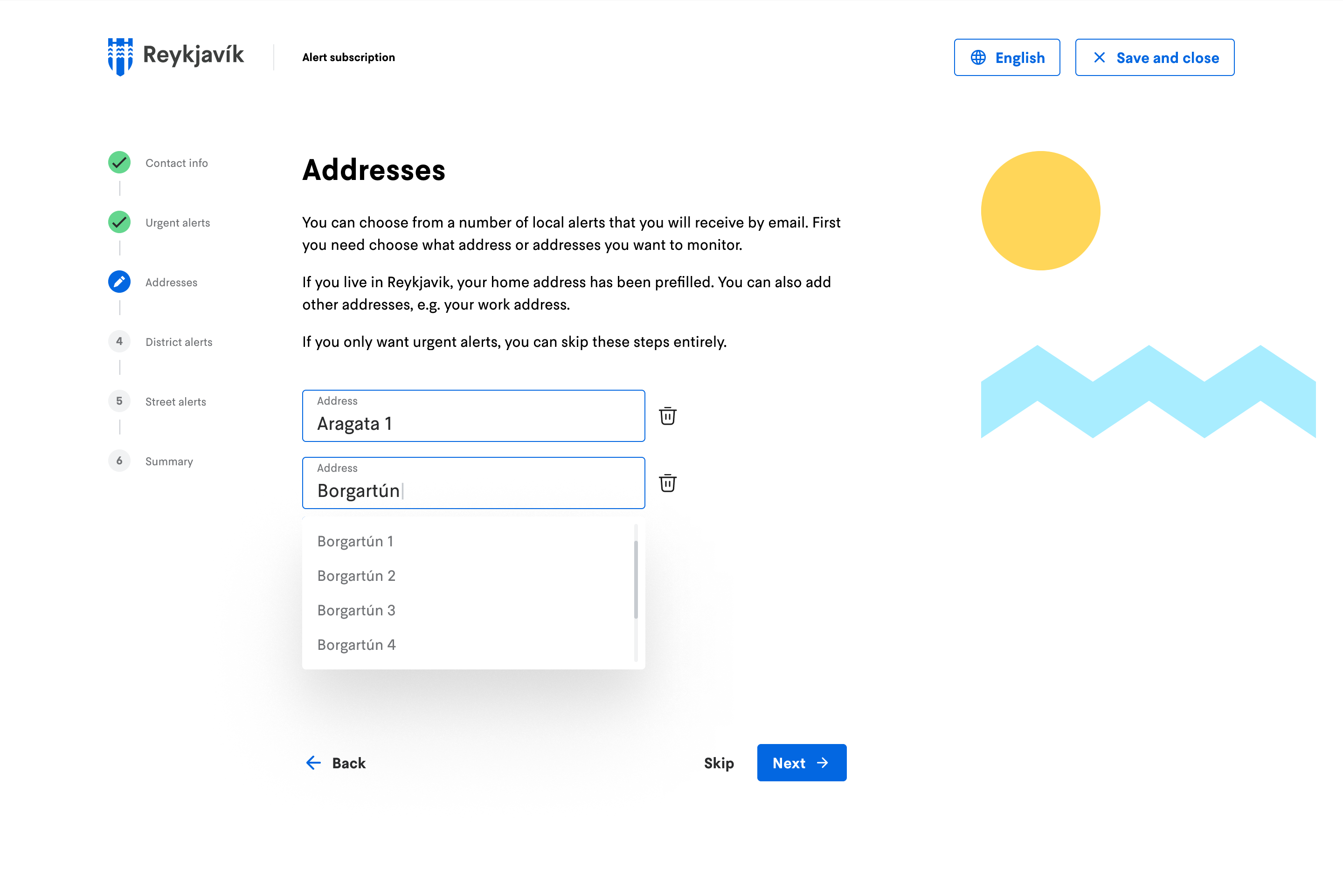
- How to handle non-residents. I decided to pull the user’s home address automatically in the flow but allow anyone to watch any street or neighborhood, since many people live outside the city but commute to it every day.
Wireframing
After developing user flows, I started with paper wireframes and translated them to mid-fi wireframes using Reykjavik’s Hanna design system.
The design has three distinct parts: the public dashboard visible to anyone on reykjavik.is, the sign-up flow that converts a visitor into a subscriber, and the notifications themselves.
Prototyping
After testing the wireframes, I designed a hi-fi prototype.
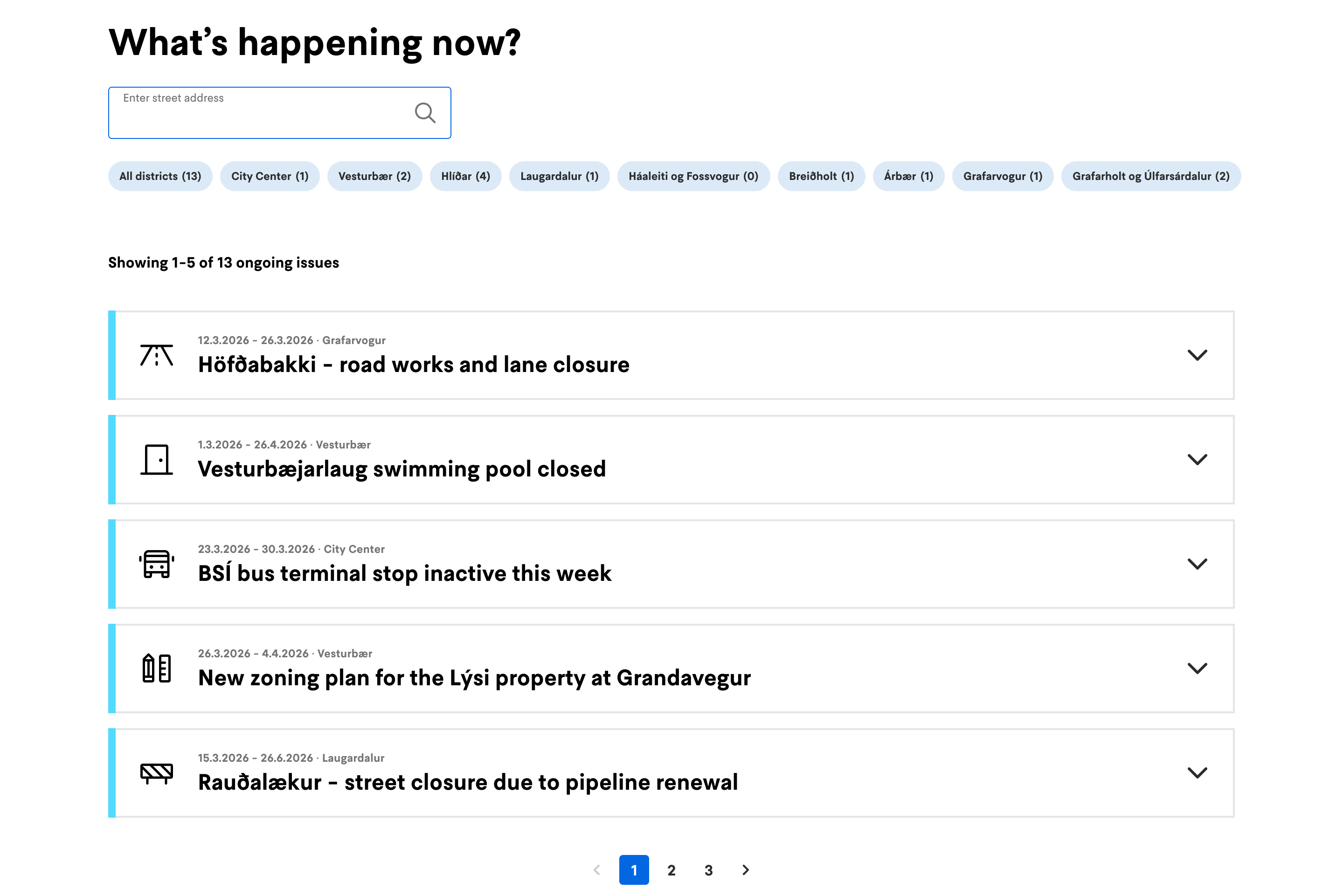
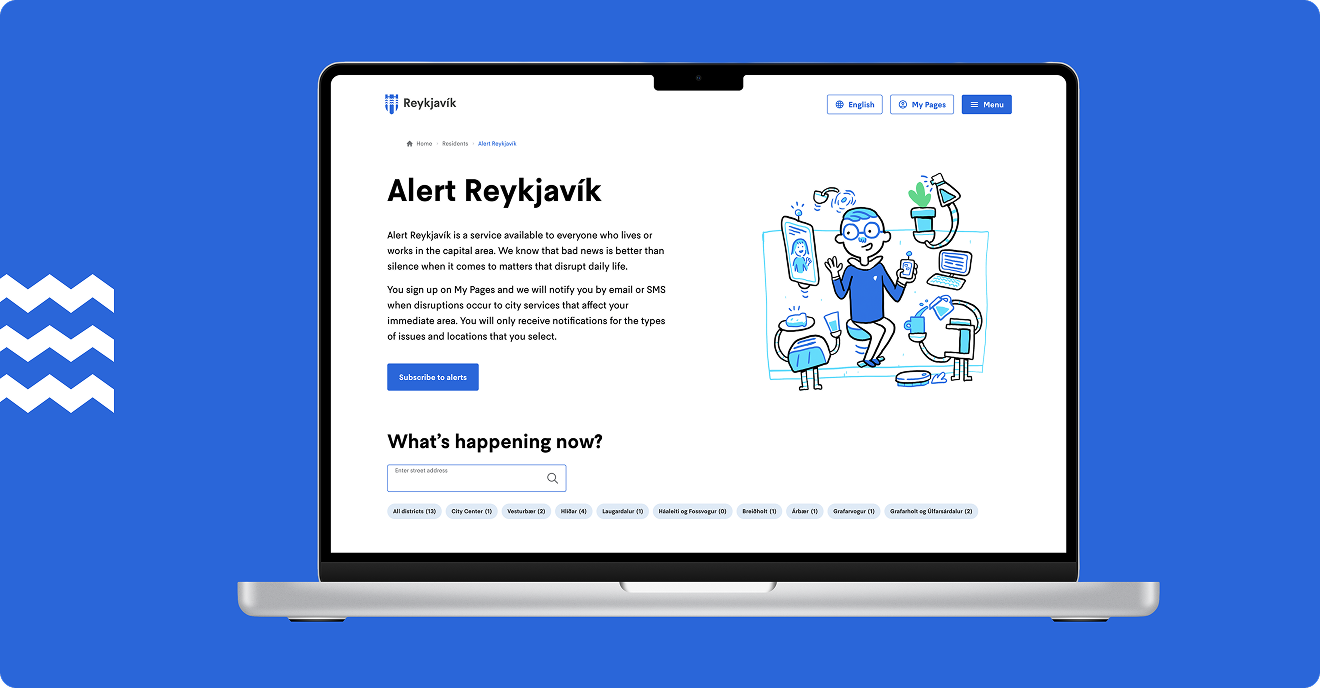
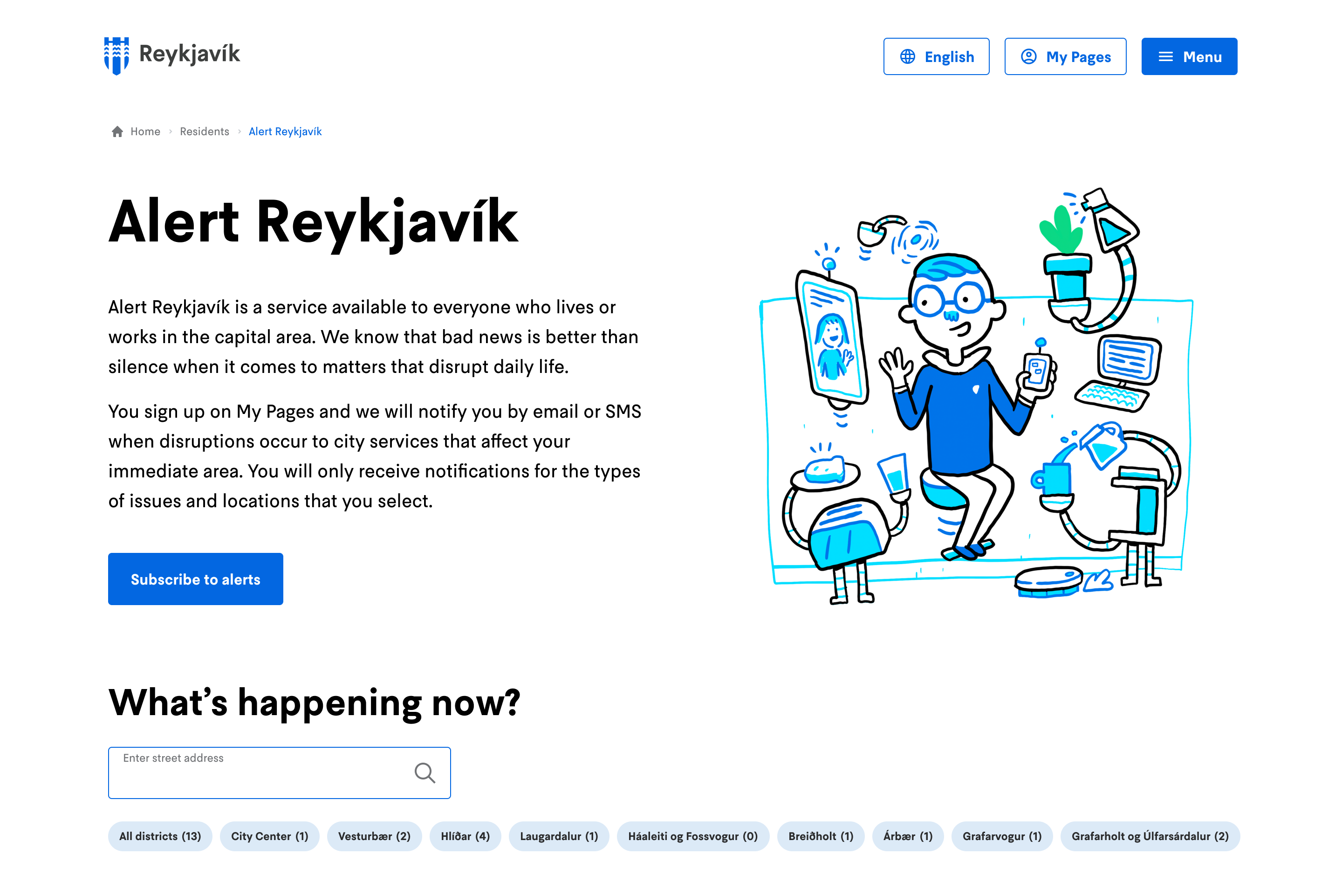
The landing page has three jobs: explain the service clearly, encourage people to sign up and serve as the entry point to the public notifications dashboard. I made the deliberate choice to make the dashboard highly visible, a live feed of real notifications, browsable by district and notification type. This gives visitors immediate evidence of what the service does.
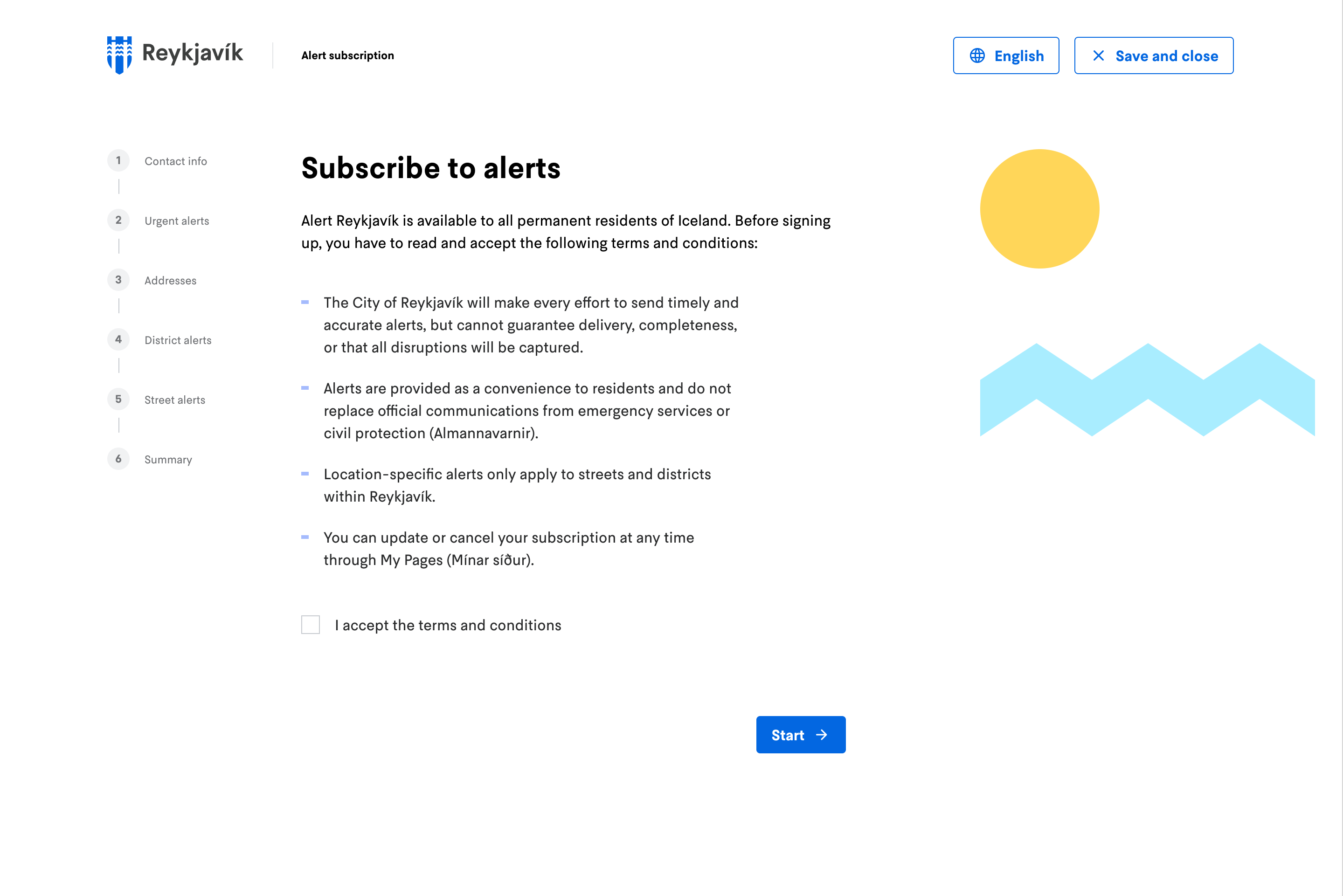
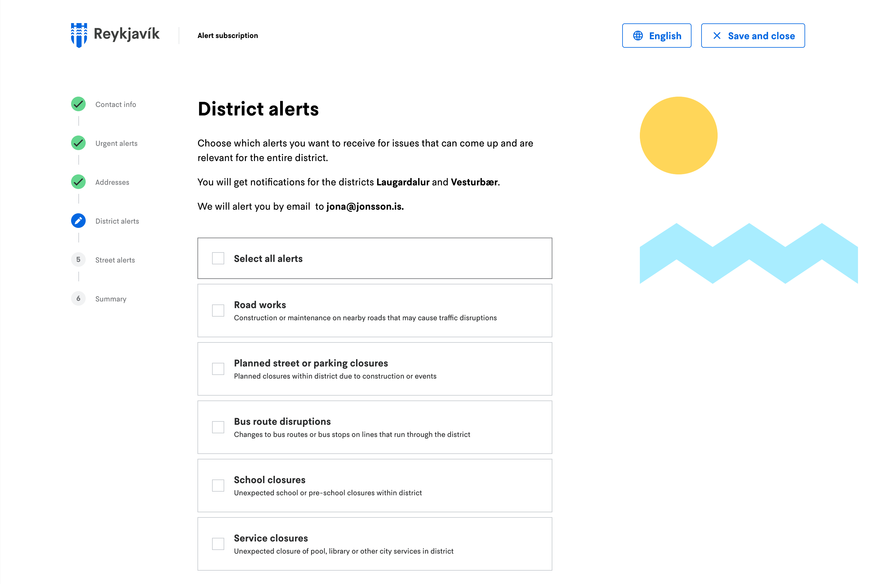
The sign-up follows the established pattern for service applications on My Pages – a multi-step flow with a progress indicator, authenticated via Icelandic digital ID. For an existing user and resident, the user’s legal address, phone number and email are pre-filled.
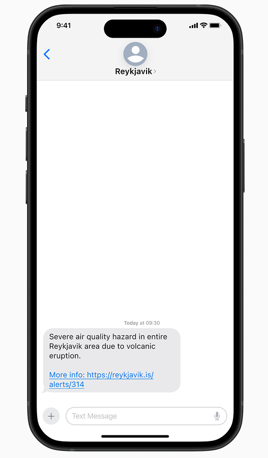
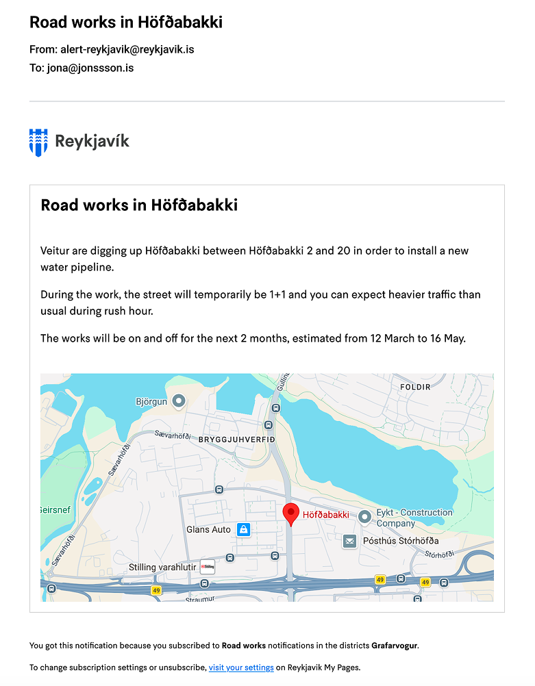
The notifications are designed for trust, clarity and right information at the right time. The email notification covers what, where, when, why and what to do. A map shows location for users unfamiliar with street names. A footer contains a one-click link to subscription settings. The SMS alert contains only actionable information and a link to further information.
Testing
I ran usability tests with 5 participants who fit the profile of the Kári persona – they are all Reykjavik area residents and commuters with children. Three tasks were given:
- Explore the dashboard without signing up
- Complete the sign-up process
- Review an email and SMS notification
Every participant gave the sign-up process a score of 10 out of 10 for ease and completed all tasks successfully. However, there were some minor issues that caused friction. Here are the key findings:
- The two-channel, one-rule design held up. The fixed SMS/email split was accepted by all participants.
- The hierarchy between the three notification types (urgent, district level, street level) was not fully understood by all.
- The pre-filled address field had a missing affordance to edit or delete.
- The SMS notification format raised questions about too long text and no link for further information, and emails raised questions about unknown streets.
Iteration
I designed the issue card below from scratch, since it was not part of the design system but I based it on all the approved design tokens.
During the design process, the list of local issues evolved from multiple colors, to two alternating colors, to a single secondary brand color.
The idea was to have a color for incident type but I soon found out that the taxonomy was too complex or domain-specific for users to understand it.
After switching to two alternating colors (without semantics) for aesthetic purposes only, I found out that having two colors still confused some users. I ended up with a single color.
The following changes and improvements were made to the design and prototype following user testing:
- Added a delete affordance to the address field
- Revised email content and added a map
- Revised SMS content – shorter message and link included.
- Revised copy in the signup process
- Added Select All option to local notifications
- Added a “How does it work” section to the landing page, explaining notifications, and removed the How does it work secondary CTA
Final result
What surprised me the most during the process is how much unreported service incidents impact the daily life of people in my city and surrounding towns, and how little has been done in Europe in general to meet this need.
The reference service Alert NYC was born out of a year of multiple critical incidents and gained political support that way. It’s easy to assume that a project like this would not be prioritized for funding simply because of optics - local politicians who advocate for this kind of service are vulnerable to unfair criticism from those who believe that the service would not be needed if everything ran smoothly.
I'm convinced that if the City of Reykjavik would deploy this service to citizens, it would gain trust in the long term and be considered a pioneer in proactive communications. Telecom providers, energy companies, transit companies and airlines all practice this kind of communication and nobody expects zero disruptions from them.