LandMatch
The challenge
Land feasibility consultants currently stitch together zoning, environmental, and infrastructure data across 10–20 sources per site. This results in a fragmented, manual workflow, costing clients (land developers) days of billable work.
Existing U.S. tools fall short on local data and source credibility, forcing consultants to stitch together fragmented research.
Research
The team did two types of research – user interviews with three land feasibility consultants, and competitive research.
Competitive analysis was done on the products Acres, ArchiWise and Algoma. All claimed to dramatically speed up the land feasibility process but specialized in different aspects of it. All had gone live nationwide. Trying them out, gathering data and looking at their demos revealed some interesting design patterns.
In the interviews, all users agreed that the above products were overpromising, especially when it comes to reliability of data. Despite trying them out, these experts still had to fall back on doing manual analysis and double-checking across multiple agencies, since some of the data turned out to be incomplete or wrong.
The research uncovered these key insights:
- A fast and confident “no” would be a win for consultants because too much time is spent on parcels that won’t work.
- The data used in the current process is always fragmented across agencies and jurisdiction-specific. Centralizing the process requires consolidating this local data.
- There needs to be a clear indication if there is no data online or unreliable data.
- Consultants are always asking themselves: Is my project permitted here, and what is the permitted density?
- Existing AI summaries and chatbots are missing reliable citations and therefore not trusted.
Problem definition
Based on these findings, we positioned LandMatch’s differentiation around a “local-first, trust-non-negotiable” strategy, reframing the goal from displaying GIS data to guiding a confident development decision.
Specifically, land feasibility consultants need:
- Quicker access to reliable land-use and density insight. Project decisions are often delayed by time-consuming manual research across multiple agencies.
- A workflow-oriented platform that mirrors existing industry processes.
- Clearer visibility into environmental constraints and permitting risks. Hidden site restrictions often lead to rework, delays and financial risk.
- A faster way to determine net developable area.
Persona
We created a primary persona based on the research. Marcus Whitmore is a senior land feasibility consultant.
Design direction
My role within the team was to design the mapping and analysis interface. I was tasked with a GIS-like map view for desktop. Based on the research, the following direction emerged:
- Use familiar GIS conventions
- Use progressive disclosure for map layers
- Express a guided workflow
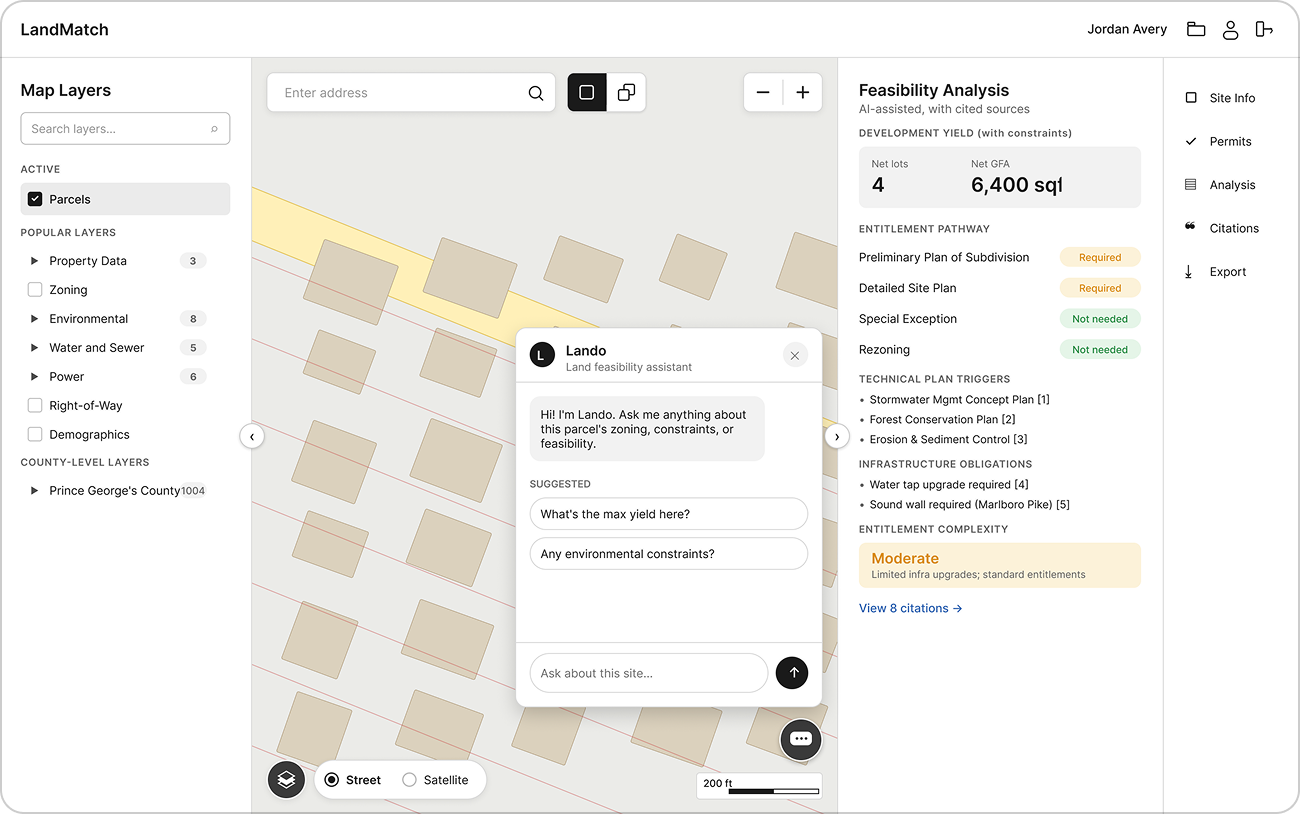
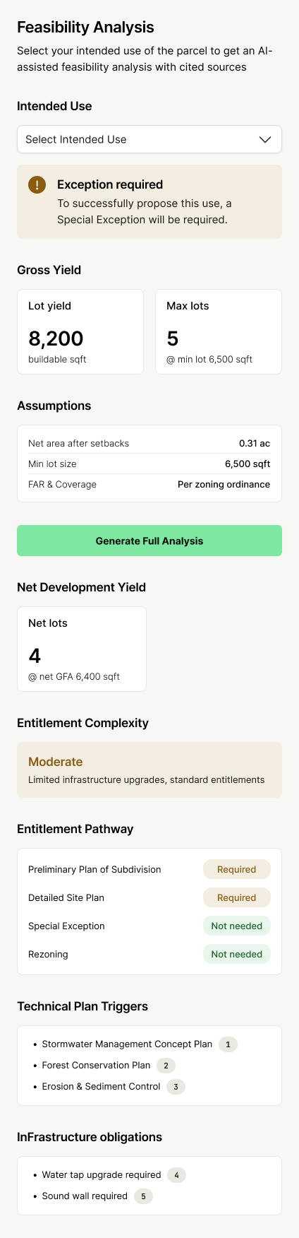
- Show feasibility headlines and net yield estimates, citing constraints
- Show actionable data in the “four buckets” – entitlements, environment, infrastructure and technical plans.
Lo-fi wireframing
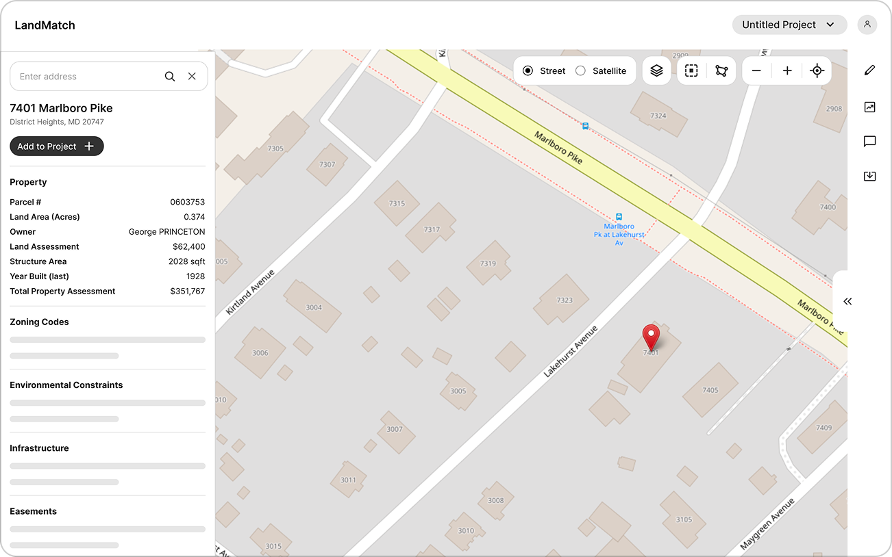
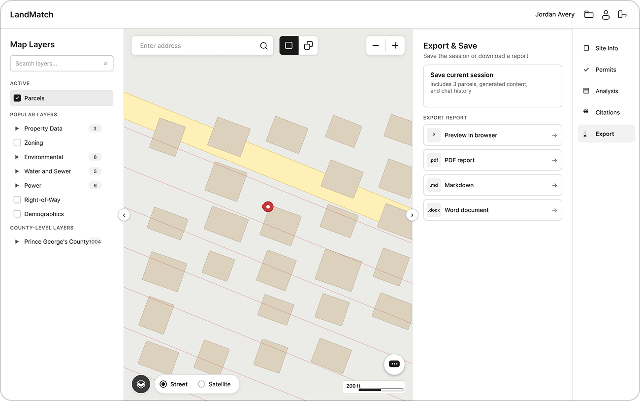
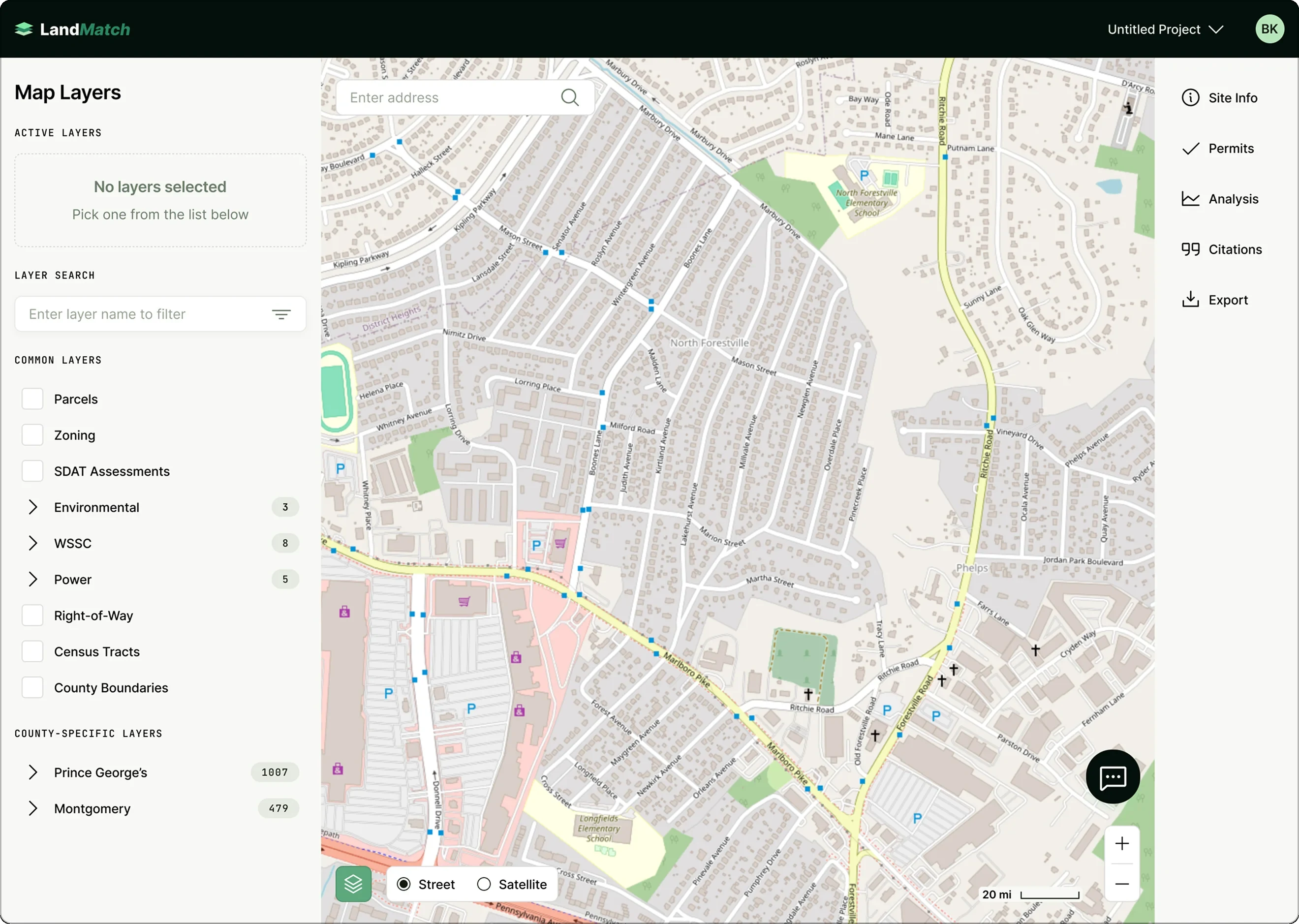
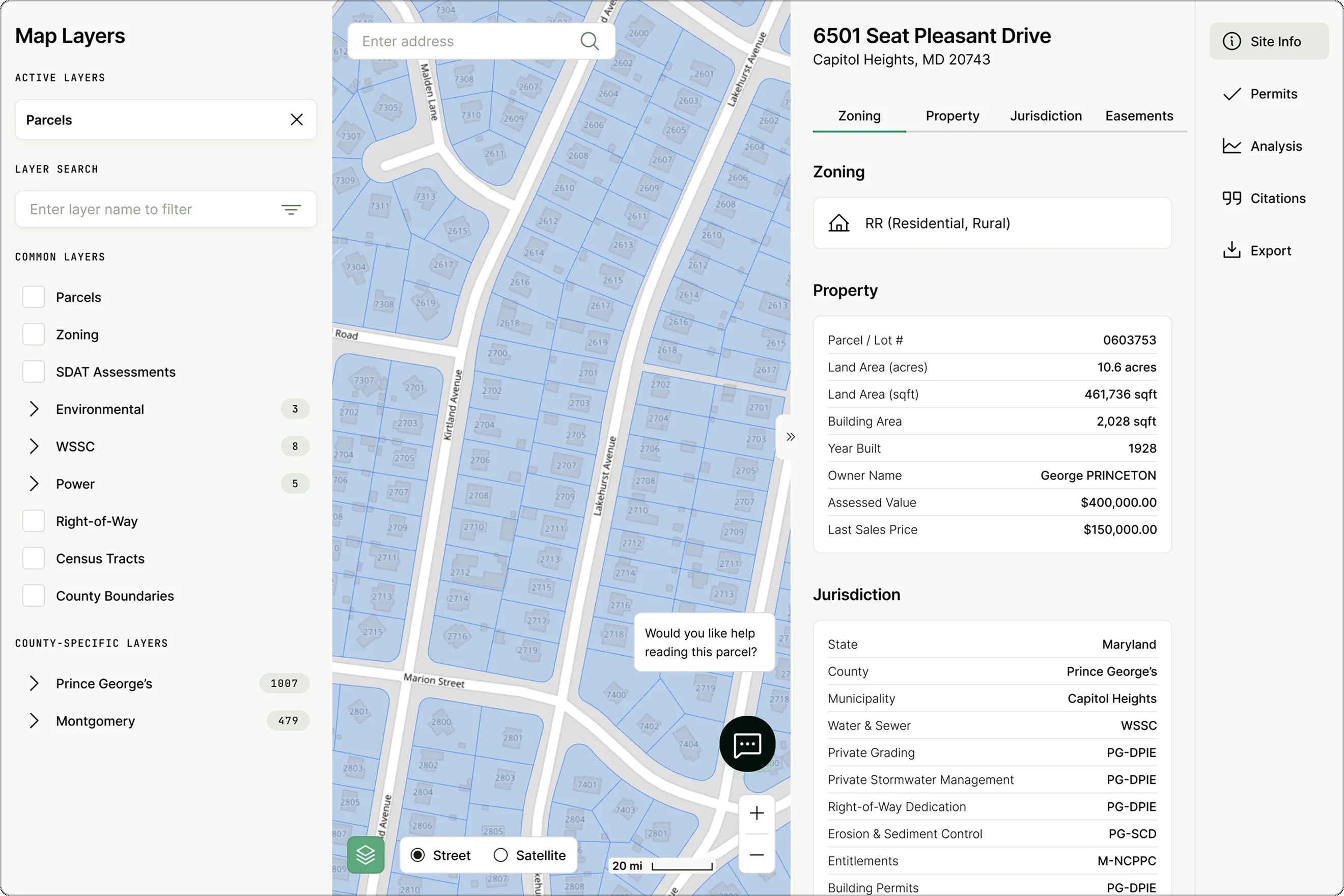
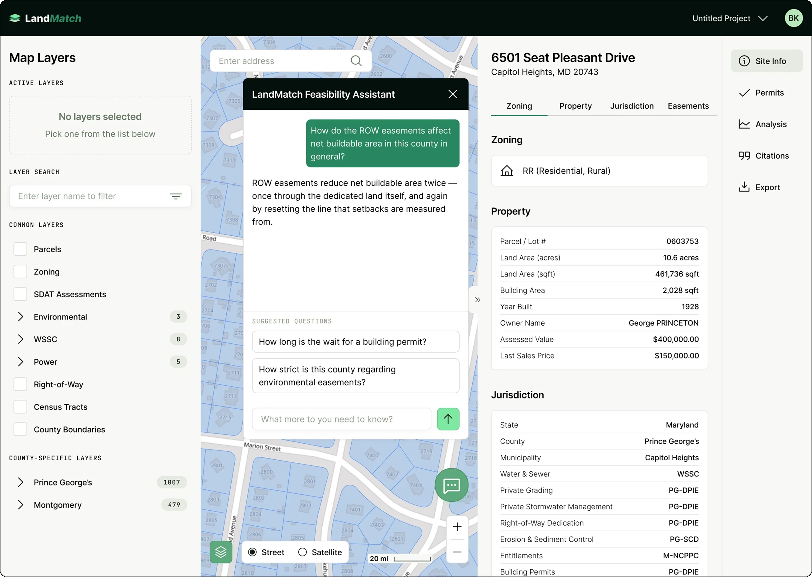
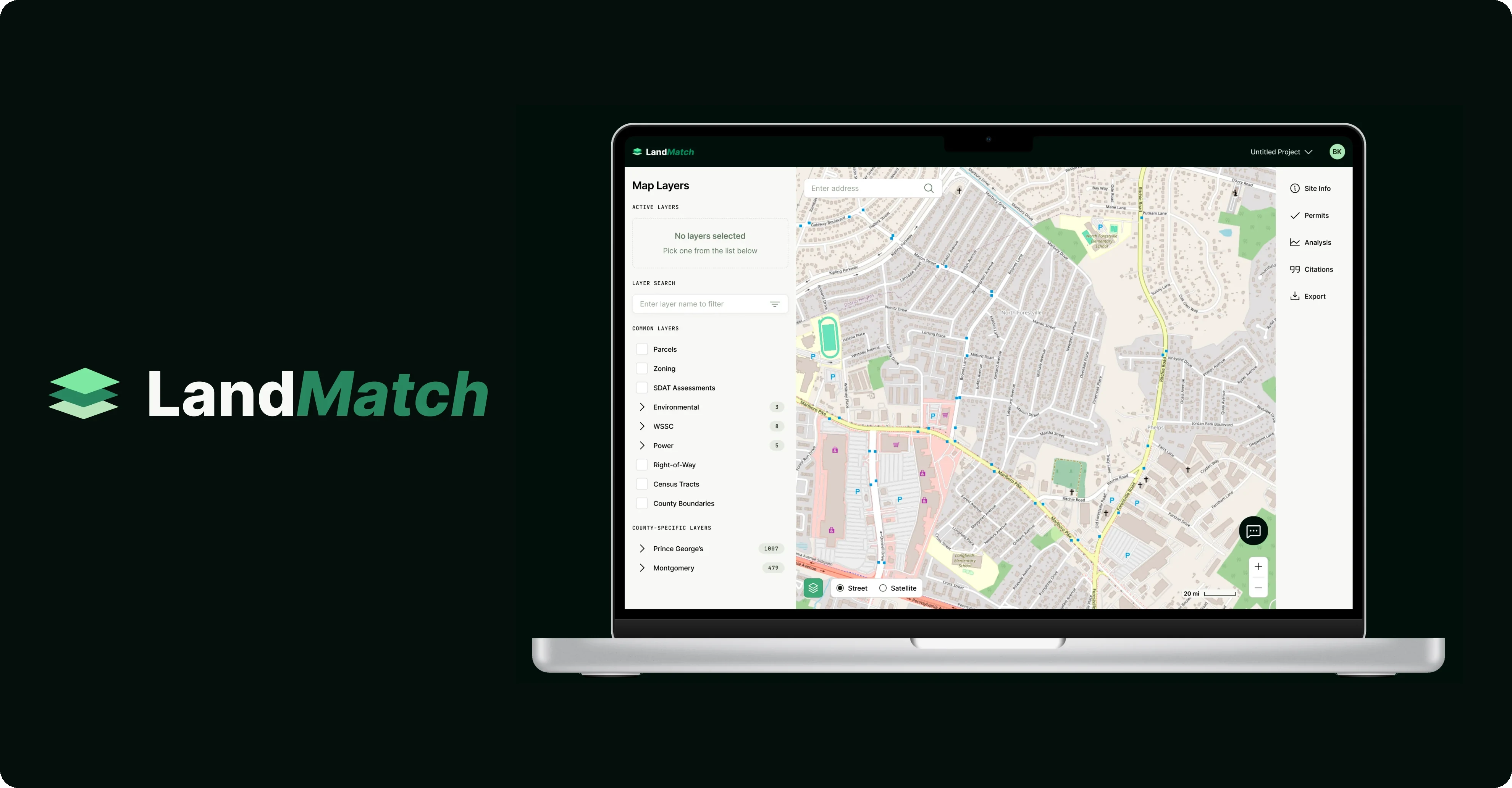
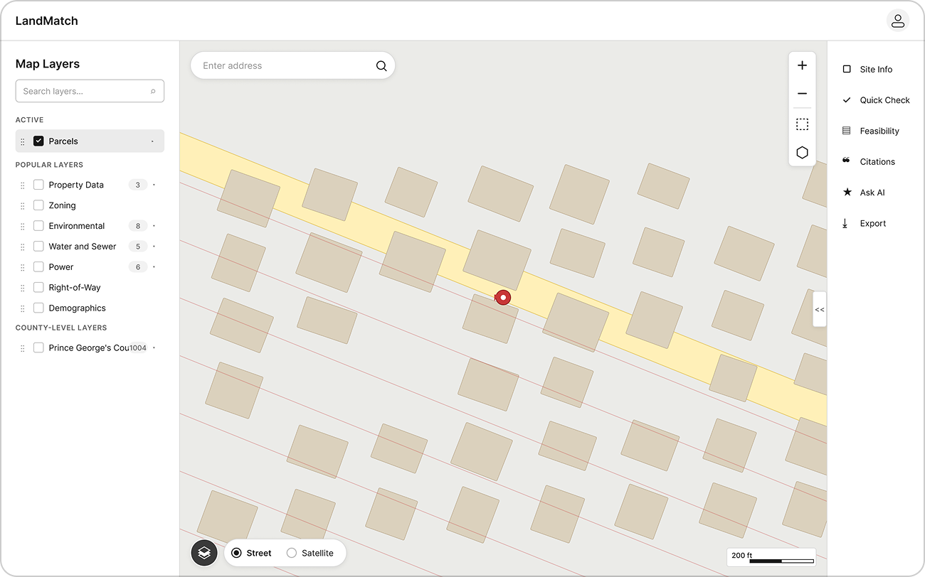
I designed a five-zone desktop layout (layers, map, site detail/analysis, menu, AI chatbot) that keeps the map as a persistent “home base” while surfacing analysis on demand. The map follows proven patterns so industry professionals feel at home.
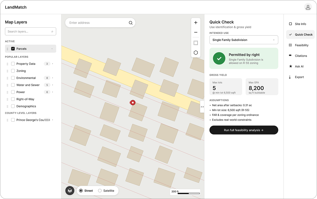
I designed a stepped feasibility flow: Site info → permits → analysis → citations → export, that mirrors how consultants actually reason through a parcel. For the analysis part, I prioritized the headline outputs – permitted use and net buildable yield, with both quick check (free version) and full analysis (paid version).
I did 3 rounds of lo-fi wireframing and sought feedback from the LandMatch team after each round, revising the draft in response.
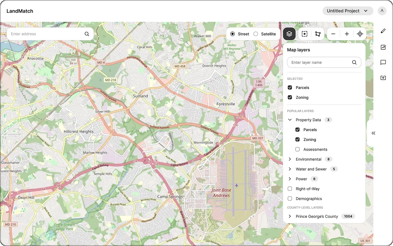
The first version had all map controls (including layers) in the top-right corner and site detail on the left, similar to Google Maps.
After initial feedback from the client, I revised the mockups to follow more established GIS patterns. The layers panel is now on the left and both site detail and analysis UI on the right.
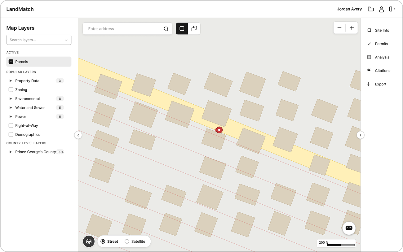
Version 3, which the hi-fi prototype is built upon, has many small refinements after a thorough review and introduces the floating chatbot action button.
Prototyping
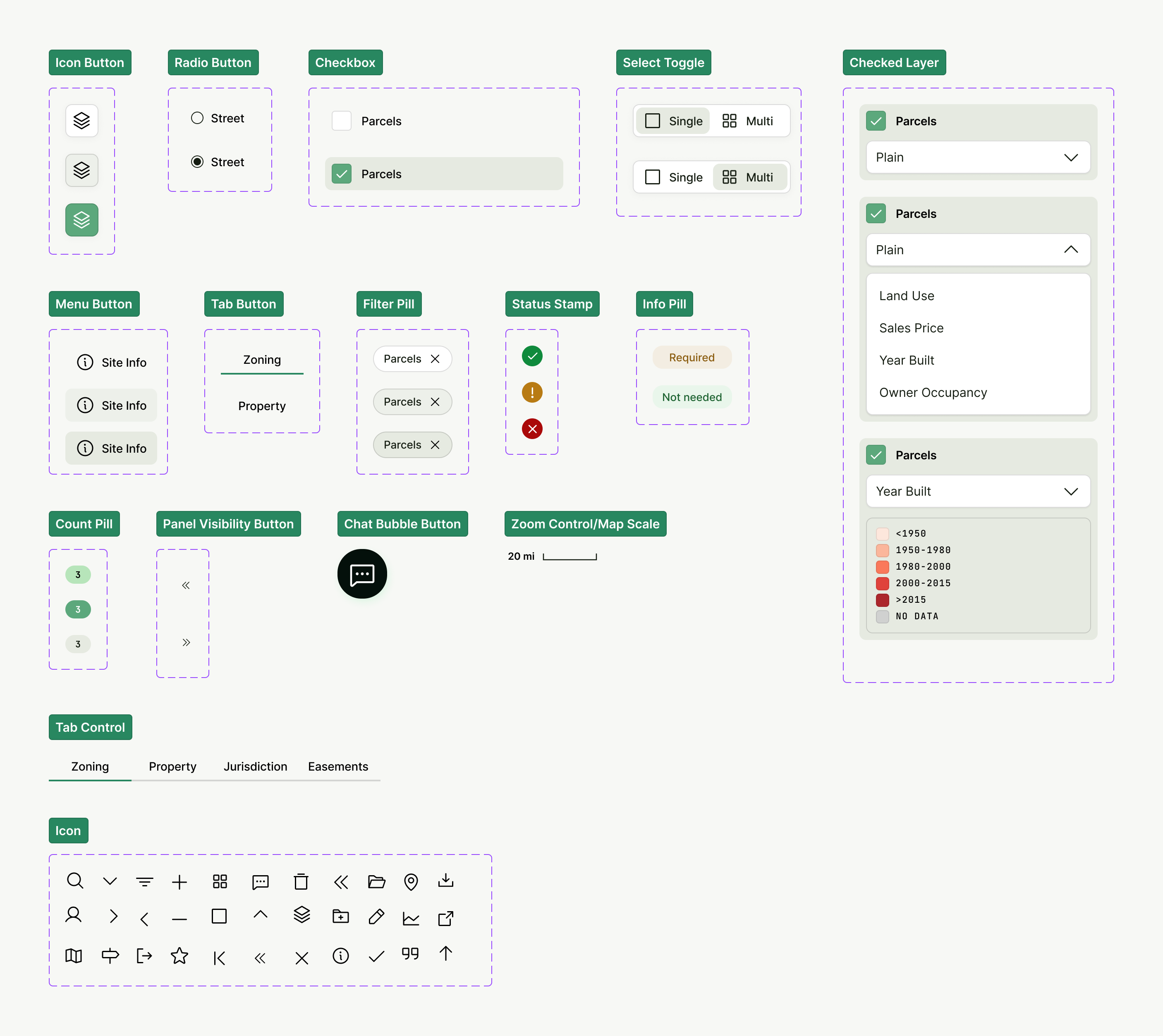
After getting to a stable lo-fi wireframe and getting approval on the brand from the LandMatch team, I designed hi-fi wireframes and UI components. I followed this through by developing a working prototype with Claude Code that served as a source of truth for interactions, logic and animations.
Testing
The team ran moderated usability tests with two civil engineers, structured around common tasks – search, exploration, analysis and export. The test confirmed the core wins while surfacing both fixable friction and valuable input for the LandMatch team that’s more seasoned in the domain.
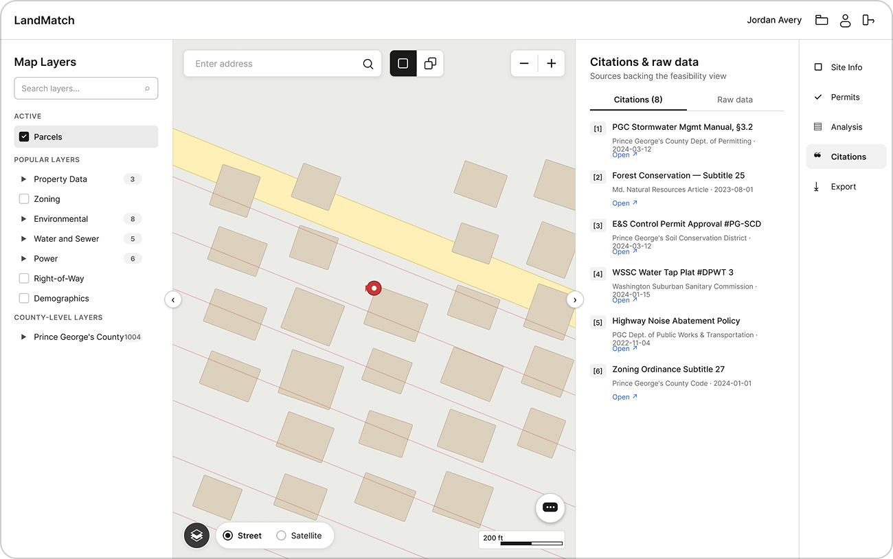
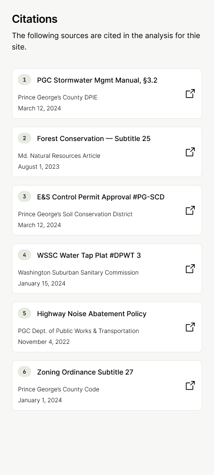
The key moments from testing was when both of the users tried to navigate by clicking the citation links. It felt obvious to us then that these small pills should have clickable links directly to the source.
Iteration
Before testing, I iterated the UI design both with the project team and the LandMatch team. One wrongful assumption that I made was that users would appreciate to work with view selection and legend in the active layers panel (topmost in the panel). The screenshot below shows how I reverted to inline selection and legend.
The following changes and improvements were made to the design and prototype following user testing and client feedback:
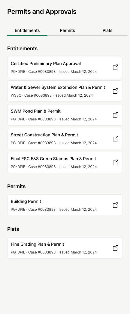
- Added case number and date context to permits panel
- Added clickable citations and permit source links
- Changed collapse/expand behavior for layers and right panel
- Changed presentation of active layers so they don’t disrupt the layer selection
- Added visual polish for chatbot and the typography in the UI
- Harmonize headlines in site detail / analysis
Final result
The result from the work on the GIS web app is a coherent, build-ready design, with a coded prototype. The product has been validated by a skeptical, expert audience as being easy to use and having a credible workflow aligned with their real practice.
The next step for the LandMatch team is to implement the new UI in their existing product. The main limitation of the current prototype is that the presentation of the analysis, as well as what direction reporting and citations can take is left up to the LandMatch team, who are experts in land feasibility analysis. But the building blocks for the analysis and overall design direction are at their disposal, and I'm looking forward to seeing them go to market.