Stund

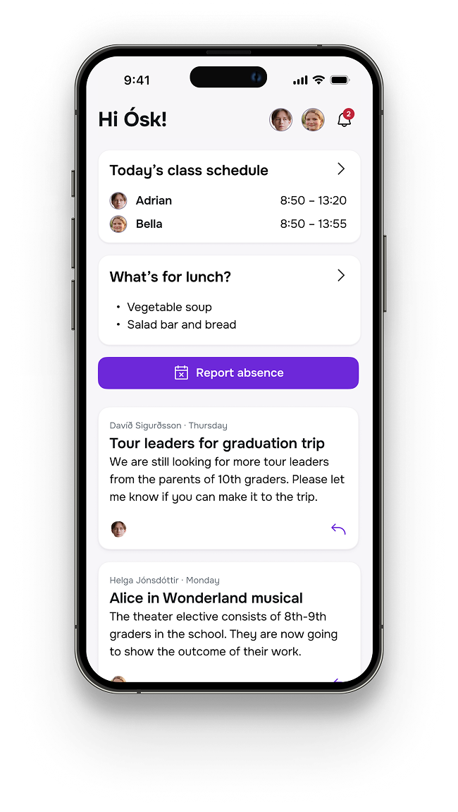
The Stund wordmark and logo beside the app's home screen on an iPhone
PLATFORM
Mobile App
ROLE
Product Discovery
Branding
UI/UX Design
TIMELINE
April – May 2026

Stund is a mobile app that simplifies the life of parents of primary school children in Reykjavík (Iceland) and helps them in their ongoing pursuit of being present and informed.

Stund helps parents understand how their children are doing in school, reaching teachers and other parents, and staying informed about important events in their children’s lives.

Open prototype

The challenge

Parenting a primary school child in Reykjavík demands a lot of organization and mental load. School-related communication is fragmented across a legacy school app (InfoMentor), Google Classroom, school websites, email and Facebook groups.

Parents who are genuinely interested in their children’s education and well-being have to navigate multiple information channels and compile their own overview of events, homework and non-standard school days. The legacy app is slow and navigation is broken. Additionally, grades are difficult to interpret due to lack of context.

Research

I analyzed 8 parent apps, classroom learning and school information systems used in the Nordics:

  • InfoMentor – the 20-year Icelandic incumbent with all the admin and grading rails, but dated UX and broken navigation.
  • Google Classroom – the classroom learning app schools use without integrating with InfoMentor for assignments, strong on coursework yet offering no official parent access. This is the second tool families work around.
  • Aula – the Danish school–home platform built expressly to fix fragmented communication, and the only reference with true guardian digests.
  • ClassDojo – the engagement category leader with the best ratings and UX, proving that consumer-grade, notification-driven messaging is the model parents actually want.
  • SchoolSoft – a complete Swedish school information system with the strongest authentication of the set (BankID, SAML/SSO, 2FA), but a Sweden-only product with no real LMS depth.
  • Wilma – Finland's nationally mandated school information system, trusted and ubiquitous, yet limited as an LMS and tightly coupled to the Finnish school structure.
  • Itslearning – a full-featured LMS with complete assignment workflows and deep Google/365 integration, but no school-admin layer and a newly relaunched app drawing very low ratings.
  • Seesaw – the standout on student portfolios and parent engagement with best-in-class UX, but limited admin features and US-centric. Nevertheless, the closest reference for what a delightful, family-friendly experience can feel like.

Survey and interviews

Having observed the above pain points, I decided to do mixed-mode research – a survey of parents and teachers to validate the problem and gather their opinions and wishes, interviews with parents and a survey of other school apps in the Nordics. Among the main research questions were:

  • How satisfied are parents and teachers with current tools, and where are the gaps in functionality?
  • What are the main frustrations of parents with the current tools?
  • What ideas do parents and teachers have about ideal tools?
  • What are the most crucial features of parent-to-school apps and why?

I ran a survey that ended up with 179 respondents. The survey quantified the dissatisfaction at NPS = -82 and a mean satisfaction score of 3.78/10. Judging from free text responses, common frustrations with the current app are navigation complexity, broken notifications, grades display, slow performance and lack of information prioritization.
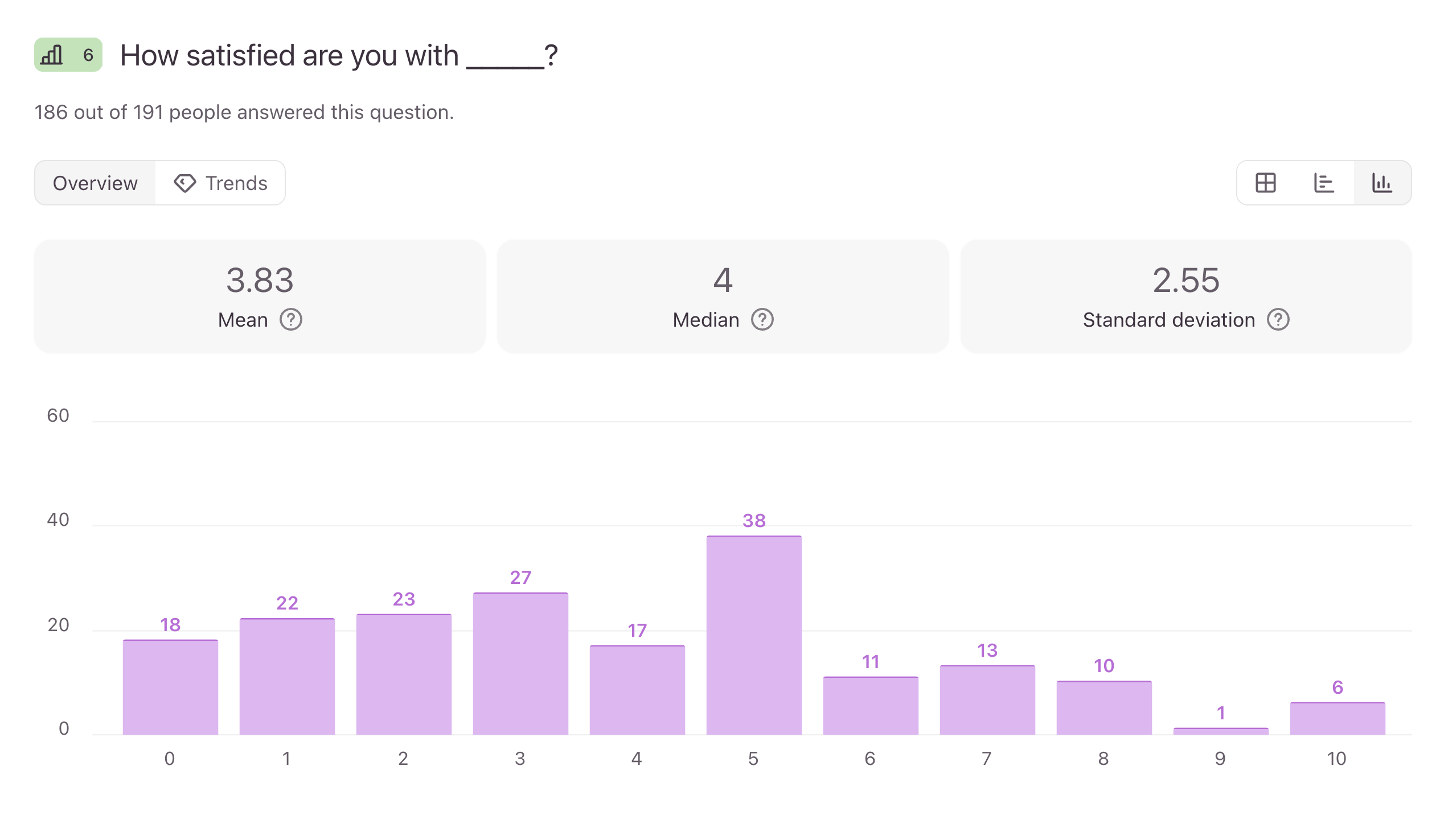
Survey results showing satisfaction scores and how parents currently rate the legacy school app

Following the survey, I interviewed five parents across six schools. The interviews yielded 7 design-driving insights:

  • Absence registration is a function that is currently reliable, and one of the primary functions needed.
  • The grading system is hard to interpret.
  • Parents rely much more on parent-teacher conferences than information flow in the app.
  • Parents want one check-in view / dashboard for their children.
  • Email is the default announcement and teacher-to-parent communication channel, and a poor one at that.
  • Parents want an in-app replacement for Facebook parent groups.
  • Information is fragmented across too many channels.
Discovery notes and an affinity map grouping research findings into themes

Problem definition

Based on these findings, I decided to envision a new product: a parent-facing app that addresses the following core problems of parents:

  • They need to connect and stay connected with their child’s school teachers, admin staff and other parents, because they need to understand how their child is doing academically, socially and emotionally.
  • They need to understand how their child is doing in individual subjects, because they need to be able to intervene when needed.
  • They need to have good overview of their child’s day and week because they want to help the child with homework and prepare for events.

Personas

I created two personas based on the research. Ósk is the primary persona, an engaged and ambitious but busy parent. Óskar is the secondary persona, a more “hands off” parent that still needs to be able to monitor and intervene.

Persona profile for Ósk Eiríksdóttir, the engaged but busy primary persona, with her goals, needs and behaviours Persona profile for Óskar Gunnsteinsson, the more hands-off secondary persona, with his goals, needs and behaviours

Product strategy

I decided to focus on the parent needs I discovered. I defined an MVP scope across 10 feature categories with strict v1 deferrals and a “maybe in the future” category. The MVP features defined were:

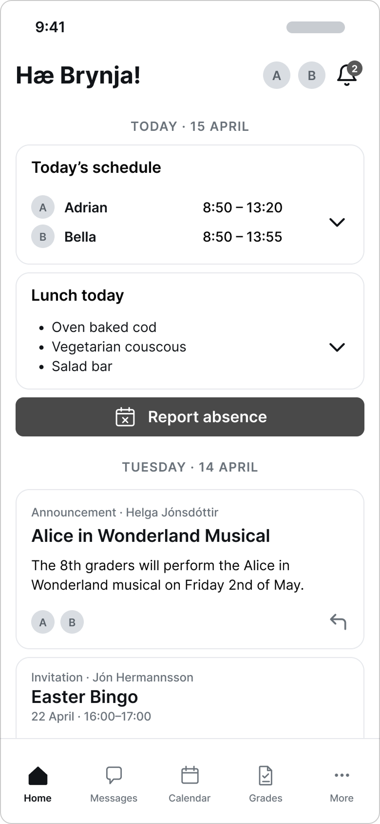
  • A multi-child unified home-screen with a daily summary, accessible absence reporting and announcement feed.
  • A unified calendar view with assignments, exams, events and deadlines.
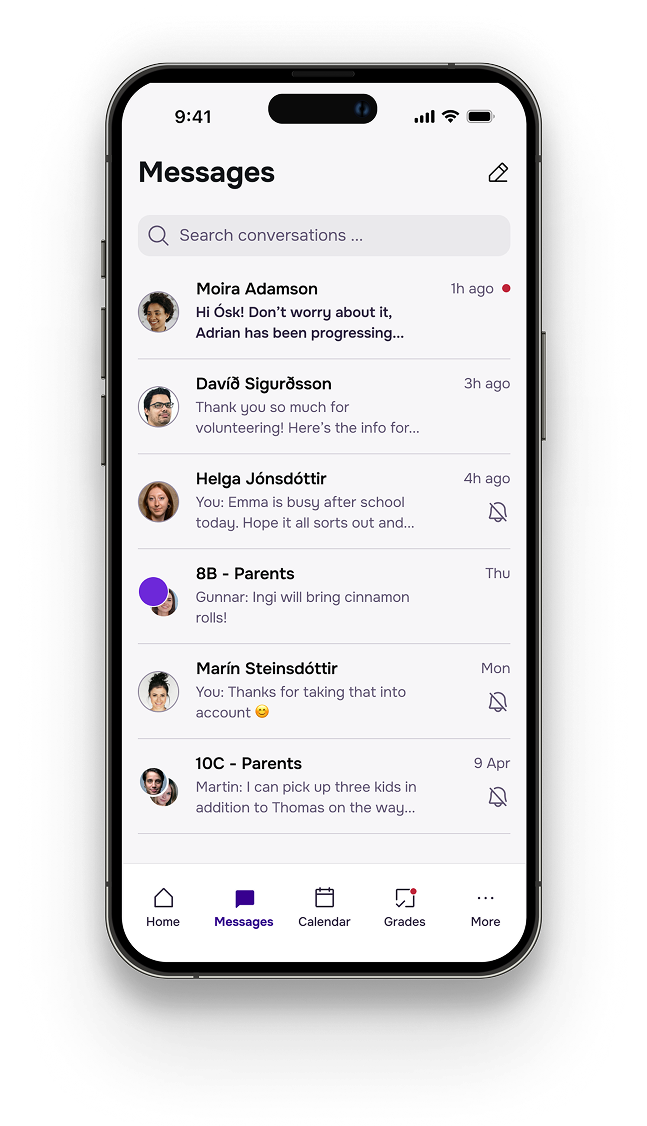
  • A messaging feature for teachers, parents and groups people belong to, with search, translation support and ability to mute conversations.
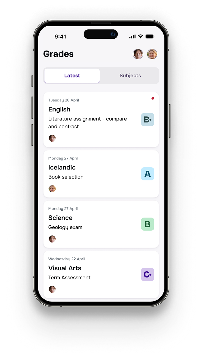
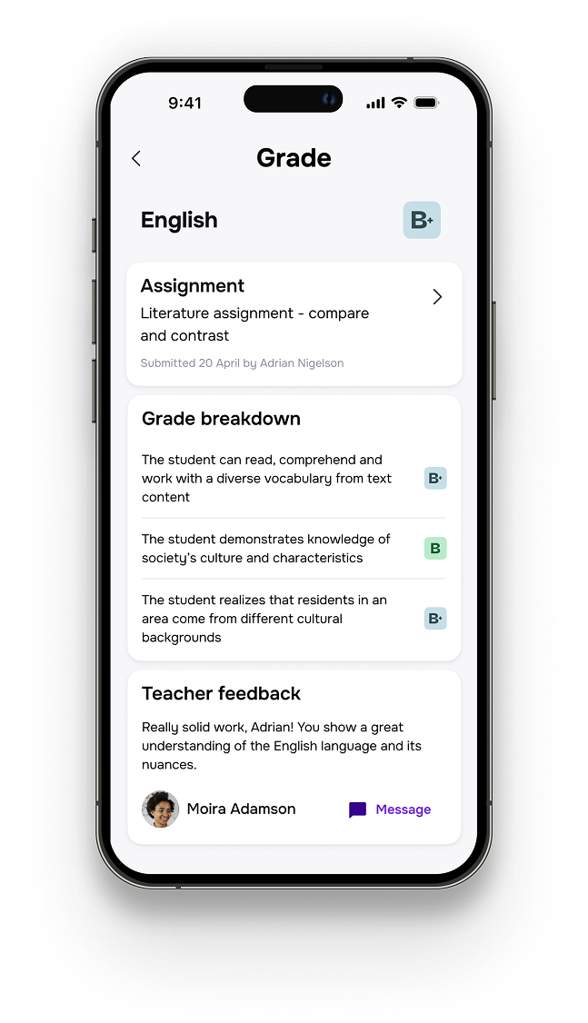
  • A chronological feed of grades with clear relation to assignment, as well as a subject overview and a detail view with rubric and teacher feedback.
  • A tiered notification system with the ability to enable push only for urgent notifications, but always with in-app badges and unread count for new content.
  • A contact directory of parents, teachers and school staff.

Sitemap

I designed a sitemap based on the product strategy and feature list, prioritizing the most important screens, features and information.

The navigation is based on a tab menu (Home, Messages, Calendar, Grades) plus an overflow menu. Below is a mapping of the screens, along with feature checklists for each.

Sitemap of the Stund app mapping screens to a tab menu, with feature checklists for each

Interaction design

I explored key interactions with two user flows – report absence and view/respond to grade.

When reporting absence, the parent can both choose to report their child absent all day (e.g. when sick) or a given timeslot (e.g. going to dentist). The flow needs to be intuitive and not request more input than necessary.

User flow for reporting an absence: from the home screen, tap Report absence, select today or tomorrow, choose all day or specific timeslots, select a reason, and the report is sent and confirmed by the school

When viewing a grade, the parent can drill down to the rubric. I decided that they should have an easy way to contact the subject teacher.

User flow for viewing and responding to a grade: from the home screen, open the Grades tab, tap a new grade to see the detail view, and optionally message the subject teacher to compose and send a message

Wireframing

I created lo-fi wireframes for key screens. I sketched them by hand, then used Claude to mock up in Figma in lo- to mid-fi as per the sketches and finally refined them manually in Figma for testing.

The lo-fi wireframes were tested to validate the information architecture and basic flow before committing to visual design.
Hand-drawn sketches exploring the Stund home screen and navigation Hand-drawn sketches exploring the grades and calendar screens
Lo-fi wireframe of the Stund home dashboard with today's schedule, lunch and announcements Lo-fi wireframe of the grades feed, latest tab Lo-fi wireframe of the grades overview by subject
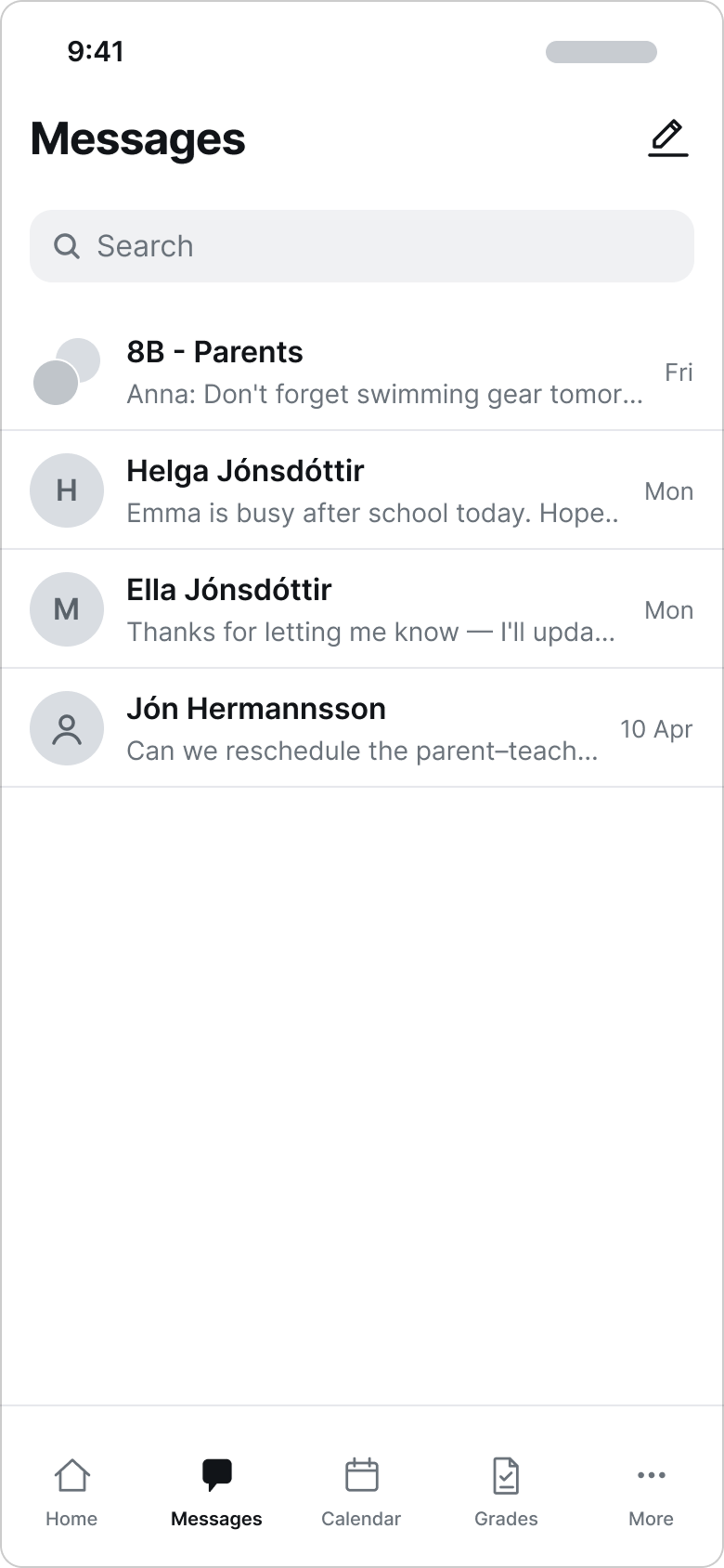
Lo-fi wireframe of the messages conversation list Lo-fi wireframe of a group conversation thread Lo-fi wireframe of the calendar with an event invitation and daily agenda

Branding

I used the research and discovery work to identify the brand values: presence, reliability, clarity and curiosity.

The name Stund means “a while” or “moment” in Icelandic and Scandinavian languages. It is also part of the Icelandic words “stundatafla” and “kennslustund” which mean “class schedule” and “class” respectively. It is commonly used when asking people if they can be present for a moment.

Colors

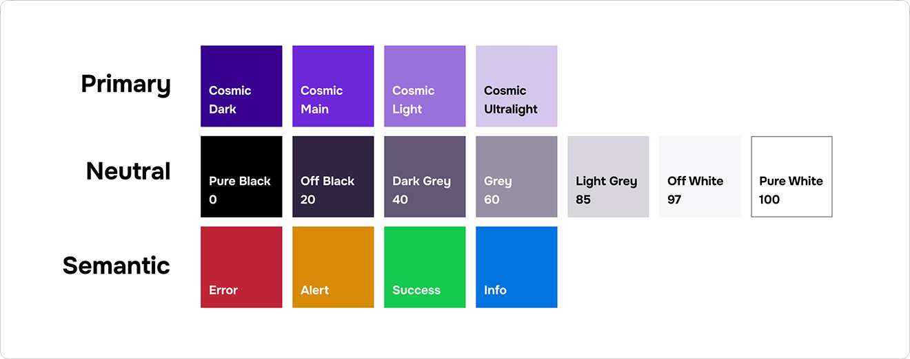
The color palette consists of only one primary color, Cosmic Violet. Violet is the highest-energy color the human eye can see. It’s a color associated with dreams, imagination, creativity and thoughtfulness – a good fit for a product centered on progressive children’s education and a conscious step away from corporate blue.

Stund colour palette: a primary, neutral and semantic scale built around Cosmic Violet

Logo and typography

The logo shows a checkmark when zoomed out (reliability), and can also be viewed as a clock (schedule, “stund”). The main metaphor is the big pencil helping the small pencil write, standing for the empowerment the product gives parents to engage and support their children in their primary education.

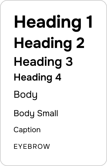
The font, Onest, is a modern geometric sans-serif with humanist warmth. It is highly legible, screen-optimized and versatile across a broad weight range, with a quietly distinctive personality. It balances the clean neutrality of a system font with the small marks of character that signal craft, care and presence.
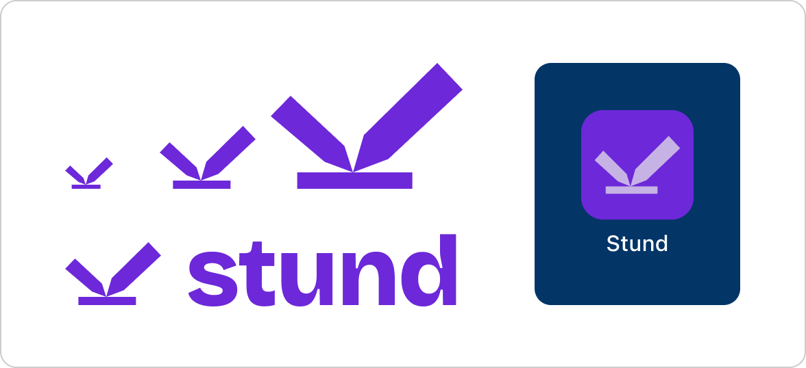
The Stund logo and wordmark, with its checkmark, clock and pencil construction Type specimen showing the Onest heading and body scale

Prototyping

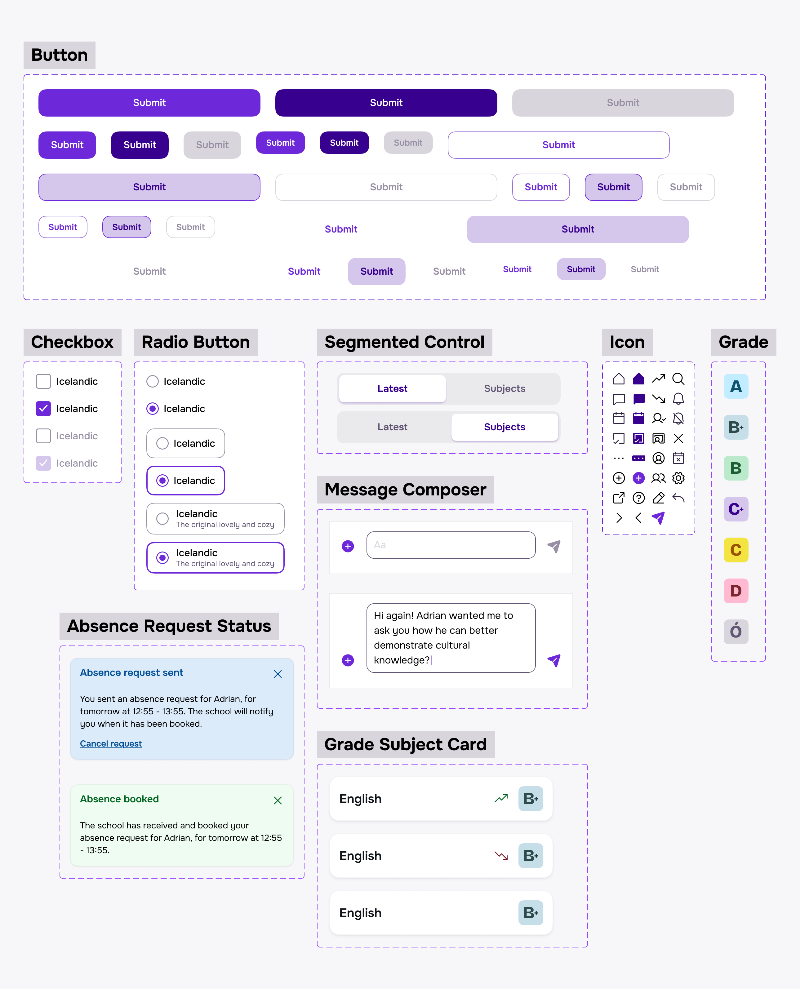
After developing the brand, I designed an on-brand UI and a hi-fi Figma prototype alongside it.

The Stund UI library, showing button states, checkboxes and radio buttons, segmented tabs, toast notifications, a message composer, the icon set, grade chips and subject list items
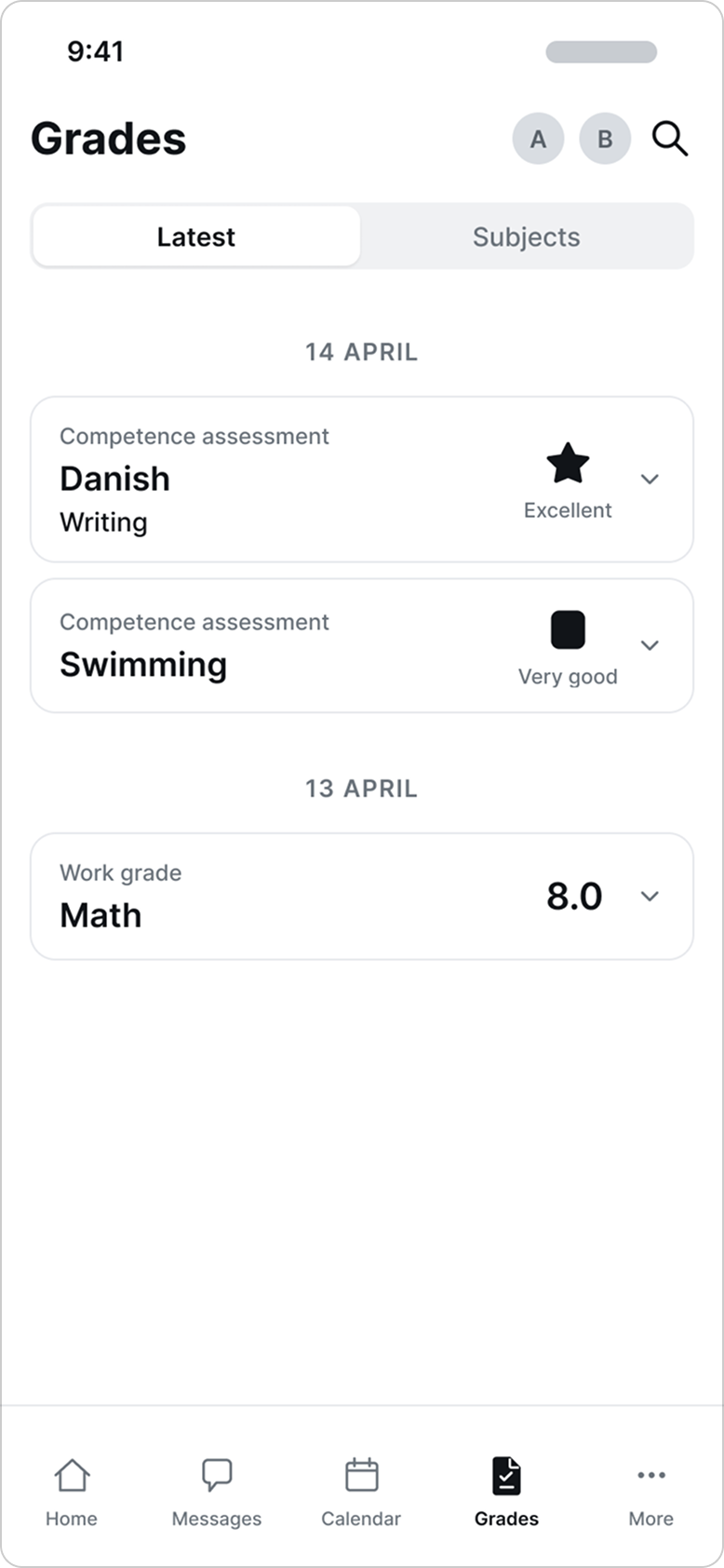
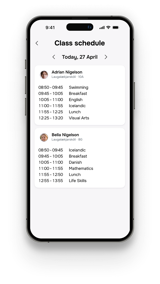
High-fidelity home dashboard greeting Ósk, with today's class schedule, lunch, absence reporting and announcements High-fidelity class schedule showing each child's timetable for the day
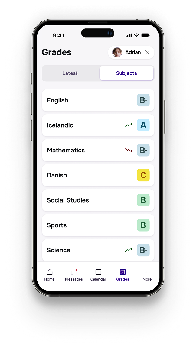
High-fidelity grades feed on the Latest tab, a chronological list of grades High-fidelity grades overview on the Subjects tab, with per-subject trends
High-fidelity grade detail for English, showing the assignment, grade breakdown and teacher feedback High-fidelity messages screen with the parent's conversation list

Testing

I tested the prototype with 5 users, four parents and one parent-teacher across three priority flows:

  • Daily check-in – home screen, detail views and notifications
  • Report absence
  • View grade details and contact teacher

The test yielded 100% task completion and very high ease-of-use ratings. Every participant had good feedback and improvement ideas that were taken into account during iteration.

Iteration

The following changes and improvements were made to the design and prototype following user testing:

  • Stronger child avatars with photos as default presentation
  • Class schedule browsable by date
  • Reason for absence (new optional field)
  • Better filter semantics – one child at a time, remove to display all again

The change in filter semantics is shown below. Instead of enabling or disabling one or more children, where none selected equals all selected, I changed the visual representation so clicking a child avatar enables a one-child filter.

Before and after of the home screen filter: previously two child avatars acting as toggles, now a single selected child shown as a removable chip

Final result

The data all points in the same direction - parents in Iceland are very unhappy with digital school communication. Not only because of a legacy app with broken core features, but because of the fragmentation of information and controversial grading methods that were adopted for primary education in Iceland about a decade ago.

Stund resolves most of these issues and the concept is validated by parents who tested the MVP prototype. They all agree that it would make them better informed and more engaged in their children's education, with much less effort.

What remains is the teacher and school side - can a usable and valuable school information system be built as a backbone for Stund, or can it leverage an existing system?